
It’s no secret I’m on a maps kick. I’m constantly sketching cool maps I want to make or GIS and scene design skills I want to develop. I also got really interested in the upcoming solar eclipse that will cross the North American continent 2,830 miles from Mazatlan, Mexico to Gander, Canada and some 43.3 million people along the way in a little over an hour and a half (four timezone changes make it seem longer).
There have been some truly astonishing maps made by people who are much better at it than I am (in no small part because it is their jobs to be good at it). The New York Times has a great visualization of the path on a global and continental scale and an infographic showing how cloudy it typically is on April 8th along the path of totality. Washington post has a mile-by-mile scroll-able strip of map that simulates what it might be like to travel along the exact totality. This one has an added 3D effect using elevation data to give some depth to the edges of the map. All of them seem inspired by the incredible 2024 eclipse map and the data supporting it produced by NASA’s Scientific Visualization Studio out of Goddard Space Flight Center.
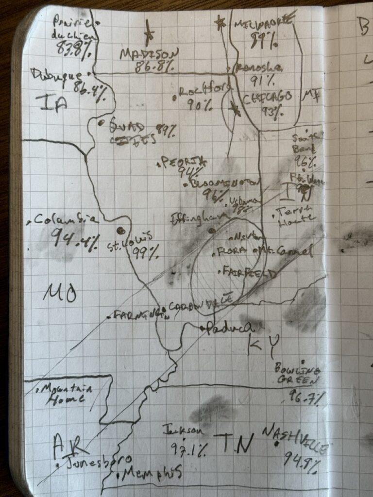
When we decided to go view the totality in southern Illinois, I got inspired by these maps, too, and started to sketch an idea for an observation guide we could take with us. The initial idea emerged from this pencil sketch in my Fieldnotes.
I started reading about how NASA made their map and eventually got sick of erasing cities and features on paper and popped open QGIS to start tinkering with the data. I liked the general idea of the map, showing ellipses that cover entire areas that will be shaded along the path of totality indicated with both lines and imagery of Earth at Night.
The result is a series of maps at 1:1,500,000 scale that show areas like the one above across the country. I laid it out in QGIS’s print composer to have a half inch margin with a title, and on the back a zoomed out version centered on the same point (scale 1:5,000,000). Then I added ellipses similar to the ones in NASA’s map to show the whole area covered at that moment.
I learned a lot about GIS and QGIS in particular making this map. The Blue Marble imagery from NASA Visual Earth doesn’t have associated world files, so I had to find or generate them. This meant the images could not be added as layers because QGIS didn’t know where to put them. Fortunately, there is a GitHub user who generated them in a gist. I learned how to crop the Black Marble layer to generate the strip of dark layer on top of the Blue. Beyond that, I learned a lot about positioning, scale, and where QGIS’s limitations are re scene design and printing. A lot of the features are there, but I suspect designing these pages would have been easier in InDesign or even Natural Scene Designer.
Still, I’m pretty happy with the result:
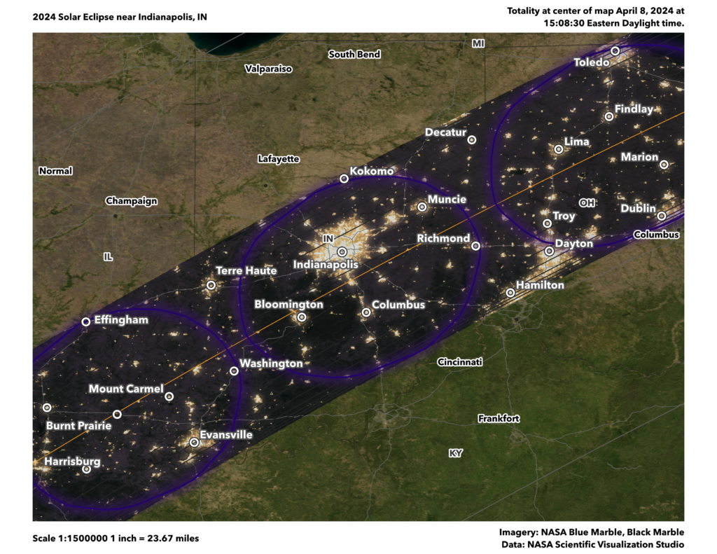
Just like in the bigger map, the black stripe represents the path of totality. A gold line runs the center of the map to show the center. Inside the stripe are contours to visualize totality duration at 30 second interval. Purple ellipses show total area covered at specific times. They are at 4.5 minute intervals, centered on the time in the map title. Finally, grey contour lines outside the totality, indicate the sun’s obscuration outside of totality. These are at 5% intervals.
In this example, the eclipse is centered on Indianapolis at 15:08:30 Eastern time. Areas to the northeast will experience totality next, and places to the southwest already experienced it. Places like Frankfort, KY; Cincinnati, OH; or South Bend, IN will experience between 95 to just shy of 100% of totality.
After some encouragement, I opened a web store to sell digital downloads of these maps to print at home. I have maps from the Texas-Mexico border all the way to the Maine-New Hampshire-Canada tri-point. Go find the one closest to you and let me know what you think! The store is definitely a work in progress, so there are some maps that don’t have full preview images right now. I hope to find time to work on that on the train tomorrow.
I also made a poster that shows the entire path across the United States. If you buy that, you can add a section map for free.
It's safe to say none of these maps would be possible without NASA's work, especially not mine. Not only the satellite imagery they are uniquely capable of creating, but the eclipse specific data is the product of skills they uniquely possess on the SVS team.
This map uses datasets from several NASA missions. The eclipse data were calculated by visualizer Ernie Wright using elevation information from SRTM, lunar topography from LRO, and planetary positions from the JPL DE421 ephemeris.
– NASA SVS 2024 Total Solar Eclipse under "Making the map"
It takes a pretty specific set of skills to know how to find, use, and combine those data to make map elements like this and I'm glad our government makes it a priority to do this work.